Another Month, Another Election: Tracking the UK General Election
Over the past few months we have already provided some live analysis of the social media activities around the Queensland and New South Wales state elections, using our Election Social Indices built on Hypometer technology. We’re now turning to Hypometer founder Darryl Woodford’s homeland to cover the UK election: tracking the major political parties (Conservatives, Liberal Democrats, Labour, UKIP and the SNP) , their nicknames/abbreviations, social media accounts, and a number of leading candidates for each party, we are able to generate in real time a picture of the social media conversation over the duration of the campaign, through to election day on 7 May.
There are three major stories in this campaign:
- Who will form government? The incumbent Conservative / Liberal Democrat coalition are fighting the election separately, and frequently in opposition to each other. Experts and polls suggest that a whole range of outcomes are possible, including both majority government for the Conservatives and Labour, however the smart money suggests either a minority government (7/4 Labour, 5/2 Conservatives) or a coalition. Amongst the coalition options, a renewal of the Conservative / Liberal Democrat coalition is possible (6/1), as is a partnership between the Liberal Democrats and Labour (13/2). The Scottish Nationals are another possible coalition partner for Labour (16/1 or 20/1 with the Lib Dems also included), while UKIP and the Democratic Unionists may still be needed to get either party over the line. Unusually for the UK then, we have a lot of electoral calculus in play.
- How will Scotland vote? As above, the SNP may play a role in a coalition, but Scotland seems set to vote on very different grounds from the rest of the UK. A recent poll suggested that almost half of both Labour and Conservative voters would consider tactically voting for the other major (English) party, if it prevented the SNP being elected in their seat – something that would be unheard of in basically any other seat, in a hangover from the Scottish Referendum. That said, they are still expected to gain a large number of seats in Scotland, and thus put themselves in a position of power at Westminster.
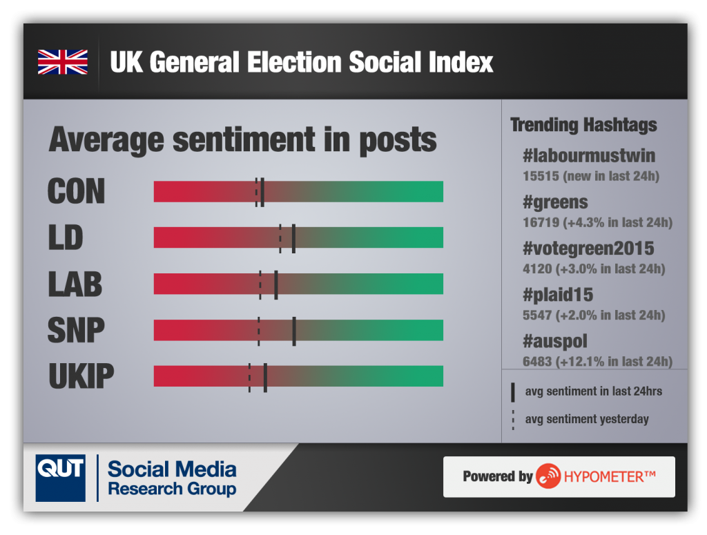
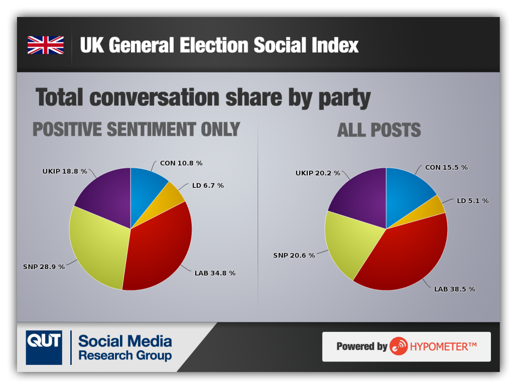
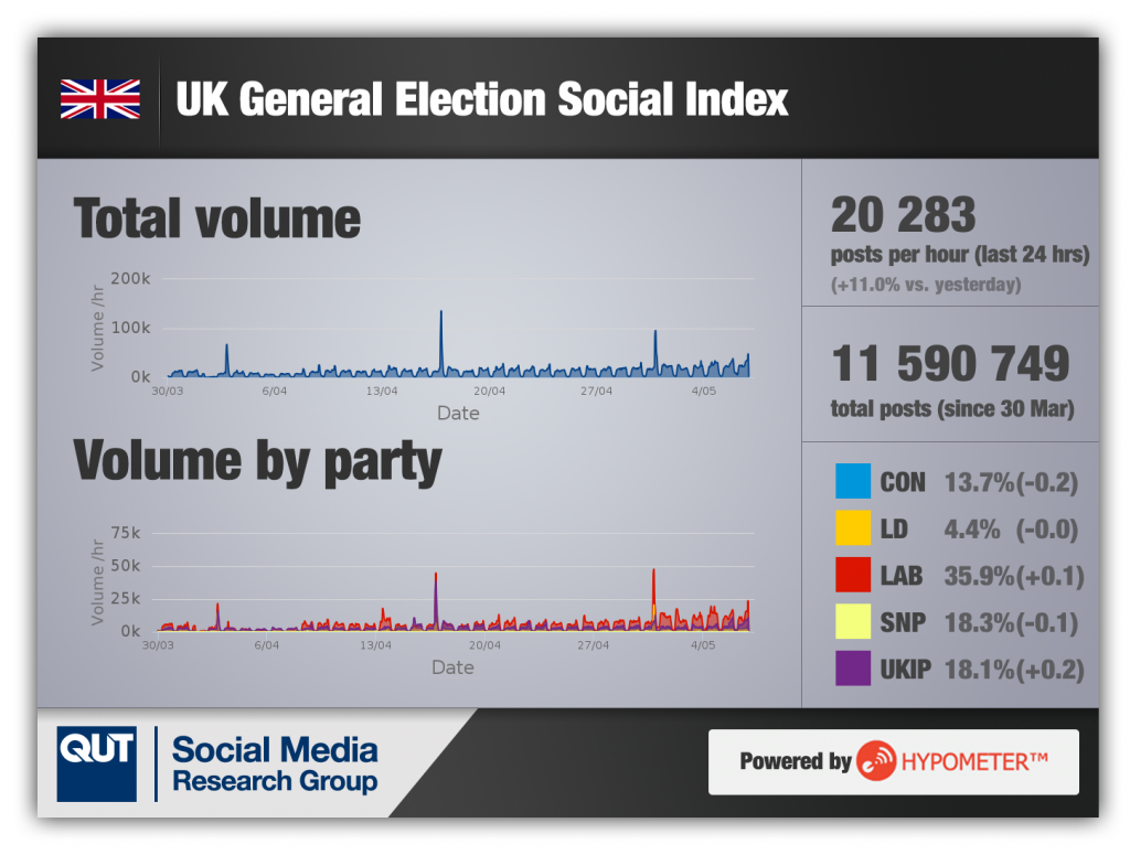
- Finally, there’s the UKIP factor. As the graphs below show, UKIP are one of the most talked-about parties of the campaign, well ahead of their expected representation in parliament (although, we should acknowledge, the UK has a first-past-the-post system, and UKIP’s representation would likely be higher in a proportional system). Paddy Power suggest that they will receive fewer than 3.5 seats (8/11), compared to 43.5 for SNP, yet the two seem to be roughly equivalent in terms of discussion on Twitter. Of course, pure volume of conversation doesn’t tell the full story, and much of the conversation around UKIP may be negative in nature – yet, our overall sentiment gauge shows little difference between UKIP and the other political parties in that regard. So, this will be interesting to watch — will interest in UKIP die down as their political prospects recede, or will we see a surprise on election day?
Aside from these, our live graphs of Twitter activity around the election tell a story of their own and are designed to be explored on a daily or even hourly basis as the social media conversation shifts in volume, tone and topic during the campaign. Previously, we have seen that major shifts in conversation do not just make for interesting journalism, but can also be cause of speculation about how the election might actually play out. We are expecting to see a more exciting representation of the conversation during this election, compared to our previous work in Queensland and new South Wales, due to the higher volume of election-related social media conversations across the UK.
The most notable change compared to our previous election coverage is the addition of the pie charts, which we think provide a much clearer visualisation of the share of conversation, and clearly compare the whole-of-campaign trends with developments over the past 24 hours. Also included are sentiment breakdowns per party, alongside currently trending hashtags, and an analysis of the total conversation volume over time.
Overall Conversation Share
Sentiment

Volume of Conversation

We plan to release some further graphs as the 7 May election date approaches – including a look at particular battleground seats, and a breakdown of the “positive” conversation around parties.
Hypometer is also undergoing some significant development in the lead-up to our first launch product – also to be released in May. You can follow the progress on the Hypometer project blog.


